Home › Forums › Photo Critique › Autumn Yellow
- This topic has 14 replies, 6 voices, and was last updated 9 years, 4 months ago by
 James Staddon.
-
AuthorPosts
-
November 4, 2014 at 5:25 pm #8106
 timtamParticipant
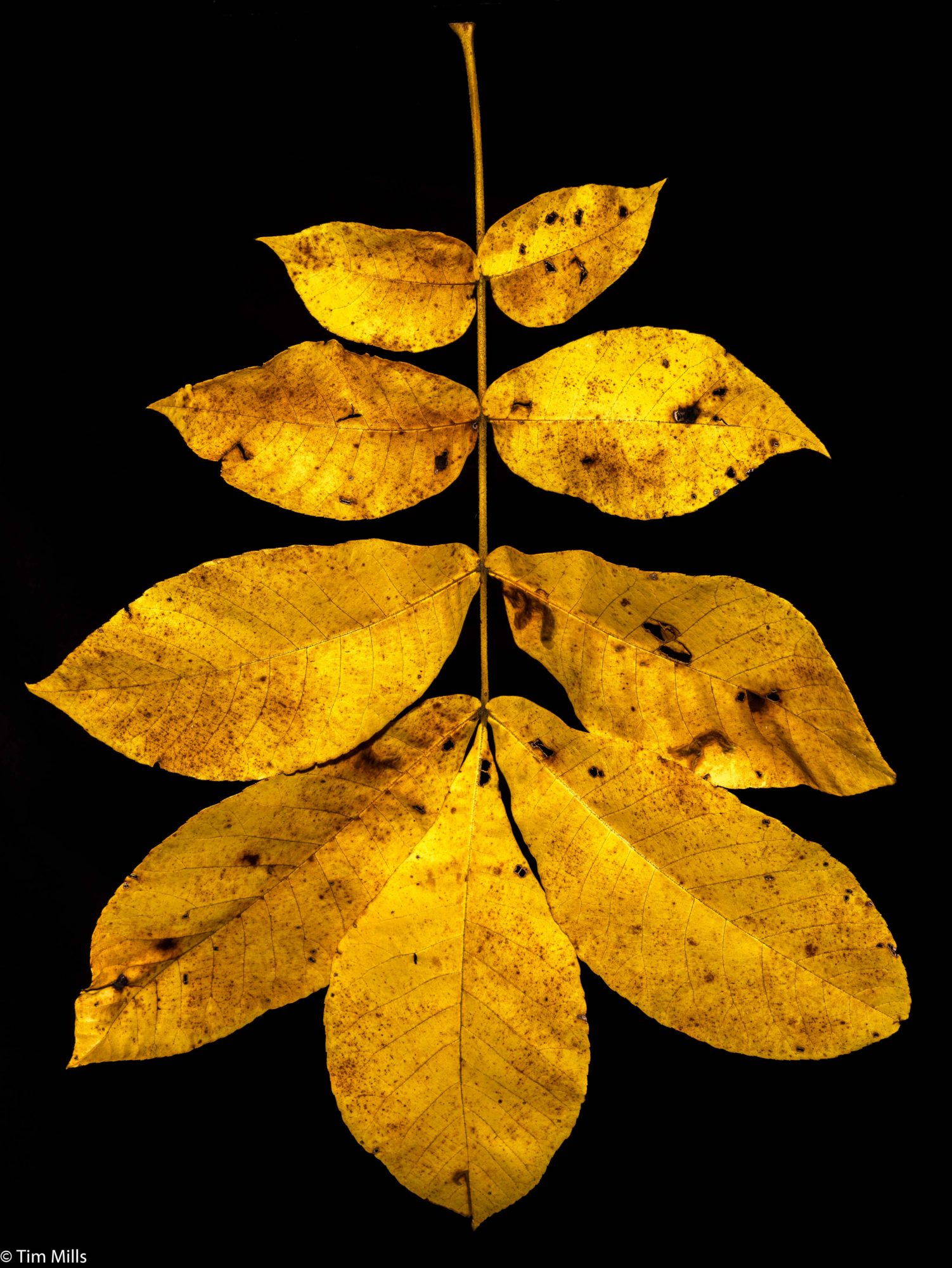
God’s perfect creation; aged, bruised, damaged, dying, and yet glorifying His name.
1/200 f/16 ISO 100 50mm flash and a reflector, tripod
Attachments:
November 4, 2014 at 7:21 pm #8114Mr. QuebecParticipantWow! Very beautiful shot!
It’s not very important, and it’s purely my opinion, but I think it will be nice if the branch was pointing up (the stem at the bottom).November 5, 2014 at 8:06 am #8125James StaddonKeymasterI was just thinking about that the other day . . . in death is the beauty of autumn. Death to our own selfish desires brings great pleasure to God. Present your bodies a living sacrifice to God because this is our reasonable service.
And not only that, but unless a tree “dies” in the winter–releases it’s leaves, conserves it’s resources, enters a period of dormancy–it will not survive the harshness of winter, like the corn of wheat that Jesus talked about in John 12. He that holds on to his life will loose it; but he that surrenders his life, will find it!
November 5, 2014 at 10:47 am #8133timtamParticipantThis is done with the stem held on a fishing hook and line from a shelf above my workbench with a black sheet behind it. The sheet needs to be back far enough (at least a few feet is best) so it will be underexposed and can be blacked out by turning down the blacks in LR. It can’t be done by laying the subject on a black background and shooting down on it. I used LR to erase the fishing line.
November 5, 2014 at 4:02 pm #8159Sarah.BrownParticipantGreat shot @timtam fall is my most favorite time of year! Also very well said James, isn’t it amazing how photography goes hand in hand with our Creator? I wouldn’t have given that any thought until I came across Lenspiration! Thank you for your God honoring example and principals in the area of photography!
November 5, 2014 at 6:08 pm #8160Ezra MorleyModeratorWow, that is certainly a nice shot! I agree with @Mr-Quebec though that it would be nice to see it “right side up” if there is a “right” side for a leaf! 🙂
Do you mind sharing some details on how you set up this shot? I’ve seen lot’s of “product shot” type of images with a white background, and I’ve even tried some myself, but I don’t know much about black backgrounds. How did you achieve the perfect black background, was it a specific lighting setup, or did you have to remove it “in post”?(I see that you already answered my question!)
November 5, 2014 at 6:41 pm #8161timtamParticipantI tried it turned up. Just doesn’t do it for me.
Getting the black background is relatively easy. Getting a white one is more difficult. You will need two flash units. the flash lighting the background can be a cheap slave unit ($20 or less). You need to light a white wall or sheet with a flash so that it is a couple of stops overexposed then adjust your main flash for the subject. You will have to play with the slave to get even lighting on the background though. Its good to have some separation between the background and subject so you can keep it our of focus. there are a bunch of YouTube videos on this subject.
- This reply was modified 54 years, 4 months ago by .
November 5, 2014 at 6:59 pm #8167Ezra MorleyModeratorGreat, thanks for the tips @timtam! I haven’t done much of this kind of thing, so it’s interesting to learn something about it! I’ll have to try it sometime!
November 10, 2014 at 10:57 pm #8237snmillerParticipantNice shot, timtam. I really like the color and the contrast against the black background. I’ve explored a bit with the effects of different backgrounds, and to my eye, at least, I think they can have a very positive effect on the impression the photo gives.
This year we’ve had beautiful fall color here in Western Oregon, and I’ve tried to capture a bit of it in a few recent shots. Here’s one where I’ve taken “artistic license” and explored the effects of boosting color saturation, contrast, etc. The real leaf had much more subtle color but the yellows and hint of green along with the graceful shape caught my eye. It’s definitely not meant to be an accurate representation of the real thing (See James’ blog for a good discussion of exaggeration). The background is a piece of gray slate, lighting is indirect outdoor lighting on a cloudy day, with a nearby tree canopy adding a hint of green.Attachments:
November 11, 2014 at 7:53 am #8240timtamParticipantThat is a spectacular shot.
November 11, 2014 at 9:38 am #8241James StaddonKeymasterThe graceful shape caught my eye too. So interesting! I noticed the slate has a greenish tint to it, which I’m sure was due to the saturation you mentioned, but if you wanted it to be a neutral color while still retaining the color in the leaf, it shouldn’t be too difficult to do in an editing program like Lightroom. What editing program do you use @snmiller?
November 11, 2014 at 8:34 pm #8252snmillerParticipantThe editing program I used was Microsoft’s Photos app, running on an ASUS T100 tablet. And yes, I was at first hoping for a neutral background, but in the end, the greenish cast didn’t seem completely out of place.
I recently downloaded Gimp on a desktop PC, and assume that it could create the neutral background. Haven’t had time yet to learn much about the program.November 12, 2014 at 9:04 am #8253James StaddonKeymasterI have no experience in GIMP, so perhaps @buddingphotographer will put together a tutorial for how to do local touchups like this. 🙂 He has already put together some helpful ones, as he mentions in Macro Bud.
November 25, 2014 at 4:26 pm #8527Ezra MorleyModerator@snmiller, I rather agree that the greenish cast “doesn’t seem completely out of place”
However, I thought it would be an interesting challenge to see what I could do in GIMP to remove it! I was originally thinking about selecting the background and desaturating it, but it turns out there’s a much easier way to do it!
Open your image in GIMP and go to ” Colors > Curves ”
%22%20transform%3D%22matrix(3.75%200%200%203.75%201.9%201.9)%22%20fill-opacity%3D%22.5%22%3E%3Cellipse%20fill%3D%22%2340411e%22%20rx%3D%221%22%20ry%3D%221%22%20transform%3D%22rotate(-178.4%2073.5%2033.4)%20scale(34.38943%2091.71701)%22%2F%3E%3Cellipse%20fill%3D%22%23fff%22%20rx%3D%221%22%20ry%3D%221%22%20transform%3D%22matrix(-5.87212%2076.31495%20-55.71777%20-4.28725%2031.4%2097.6)%22%2F%3E%3Cellipse%20fill%3D%22%23fff%22%20cx%3D%22241%22%20cy%3D%2295%22%20rx%3D%2237%22%20ry%3D%2283%22%2F%3E%3Cellipse%20fill%3D%22%238c932a%22%20rx%3D%221%22%20ry%3D%221%22%20transform%3D%22matrix(4.09268%20-35.37202%2030.09143%203.4817%20134.8%20104.3)%22%2F%3E%3C%2Fg%3E%3C%2Fsvg%3E)
Now select the “Green” color curve option.
%27%20fill-opacity%3D%27.5%27%3E%3Cellipse%20fill%3D%22%23fff%22%20fill-opacity%3D%22.5%22%20rx%3D%221%22%20ry%3D%221%22%20transform%3D%22rotate(68.9%20-65.5%20303)%20scale(133.86145%20103.89724)%22%2F%3E%3Cpath%20fill%3D%22%23969696%22%20fill-opacity%3D%22.5%22%20d%3D%22M387.5%2053.8L3%2060.5%201-51.7l384.4-6.7z%22%2F%3E%3Cellipse%20fill%3D%22%23acacac%22%20fill-opacity%3D%22.5%22%20rx%3D%221%22%20ry%3D%221%22%20transform%3D%22rotate(-104.2%20167.8%20195.7)%20scale(250.80885%2059.11032)%22%2F%3E%3Cellipse%20fill%3D%22%23fff%22%20fill-opacity%3D%22.5%22%20rx%3D%221%22%20ry%3D%221%22%20transform%3D%22rotate(65.2%20-82.4%20310.6)%20scale(116.53394%20102.86267)%22%2F%3E%3C%2Fg%3E%3C%2Fsvg%3E)
Now grab the line right in the middle and pull it down a bit, you can adjust it till it looks about right.
%27%20fill-opacity%3D%27.5%27%3E%3Cellipse%20fill%3D%22%23fff%22%20fill-opacity%3D%22.5%22%20rx%3D%221%22%20ry%3D%221%22%20transform%3D%22rotate(-25.4%20672%20-390)%20scale(113.71482%20144.6463)%22%2F%3E%3Cpath%20fill%3D%22%23979797%22%20fill-opacity%3D%22.5%22%20d%3D%22M388.6-58.7l2%20112.2-419.7%207.3-2-112.2z%22%2F%3E%3Cellipse%20fill%3D%22%23a4aba9%22%20fill-opacity%3D%22.5%22%20rx%3D%221%22%20ry%3D%221%22%20transform%3D%22rotate(-8.2%202602%2031.9)%20scale(46.83766%20375.609)%22%2F%3E%3Cellipse%20fill%3D%22%23fff%22%20fill-opacity%3D%22.5%22%20rx%3D%221%22%20ry%3D%221%22%20transform%3D%22matrix(71.56137%2094.96515%20-75.7361%2057.07124%20237.2%20257.4)%22%2F%3E%3C%2Fg%3E%3C%2Fsvg%3E)
Voila! Green cast is all gone! Note that it does affect the other colors slightly, but I’m assuming that if the rock was “off” then the rest of the picture was too, so the whole thing should be more realistic. You may want to back down slightly on the saturation, since modifying the green channel basically made the whole leaf more saturated.
%22%20transform%3D%22translate(2.5%202.5)%20scale(4.92188)%22%20fill-opacity%3D%22.5%22%3E%3Cellipse%20fill%3D%22%23d88407%22%20cx%3D%2289%22%20cy%3D%22120%22%20rx%3D%2234%22%20ry%3D%2242%22%2F%3E%3Cellipse%20fill%3D%22%230a0f15%22%20rx%3D%221%22%20ry%3D%221%22%20transform%3D%22rotate(87.7%20-60.3%20159)%20scale(52.67477%20181.99999)%22%2F%3E%3Cellipse%20fill%3D%22%2348484a%22%20rx%3D%221%22%20ry%3D%221%22%20transform%3D%22matrix(-173.23577%20-16.84706%205.89583%20-60.62589%20111.2%2047.7)%22%2F%3E%3Cellipse%20fill%3D%22%237f5f0d%22%20cx%3D%2286%22%20cy%3D%22126%22%20rx%3D%2240%22%20ry%3D%2256%22%2F%3E%3C%2Fg%3E%3C%2Fsvg%3E)
UPDATE: I created a tutorial with this same material here.
Attachments:
November 26, 2014 at 8:16 am #8540James StaddonKeymasterHey, it’s great to see GIMP supports curves adjustments! Didn’t know that. I agree that using curves is a great way to remove color casts.
-
AuthorPosts


You must be logged in to reply to this topic.